How to build a branded carousel system
One character, one structure, content you can produce in an afternoon
For Australian businesses who want to look consistent online without a design team
Why most content dies before it ships
The problem isn't ideas. It's that every post starts from a blank page, so it never gets made.
Most owners know they should be posting. The reason it doesn't happen isn't laziness, it's friction. Every post means a fresh decision about layout, colour, font, and what goes where. When the work starts from nothing each time, it gets pushed to next week, and next week never comes.
The fix is to stop making one-off posts and build a system instead. You decide the look once, you give it a recognisable character, and then producing a new post is mostly swapping words. That's the difference between posting when you feel inspired and posting every week without thinking about it.
A system you'll actually use beats a perfect design you make once and abandon.
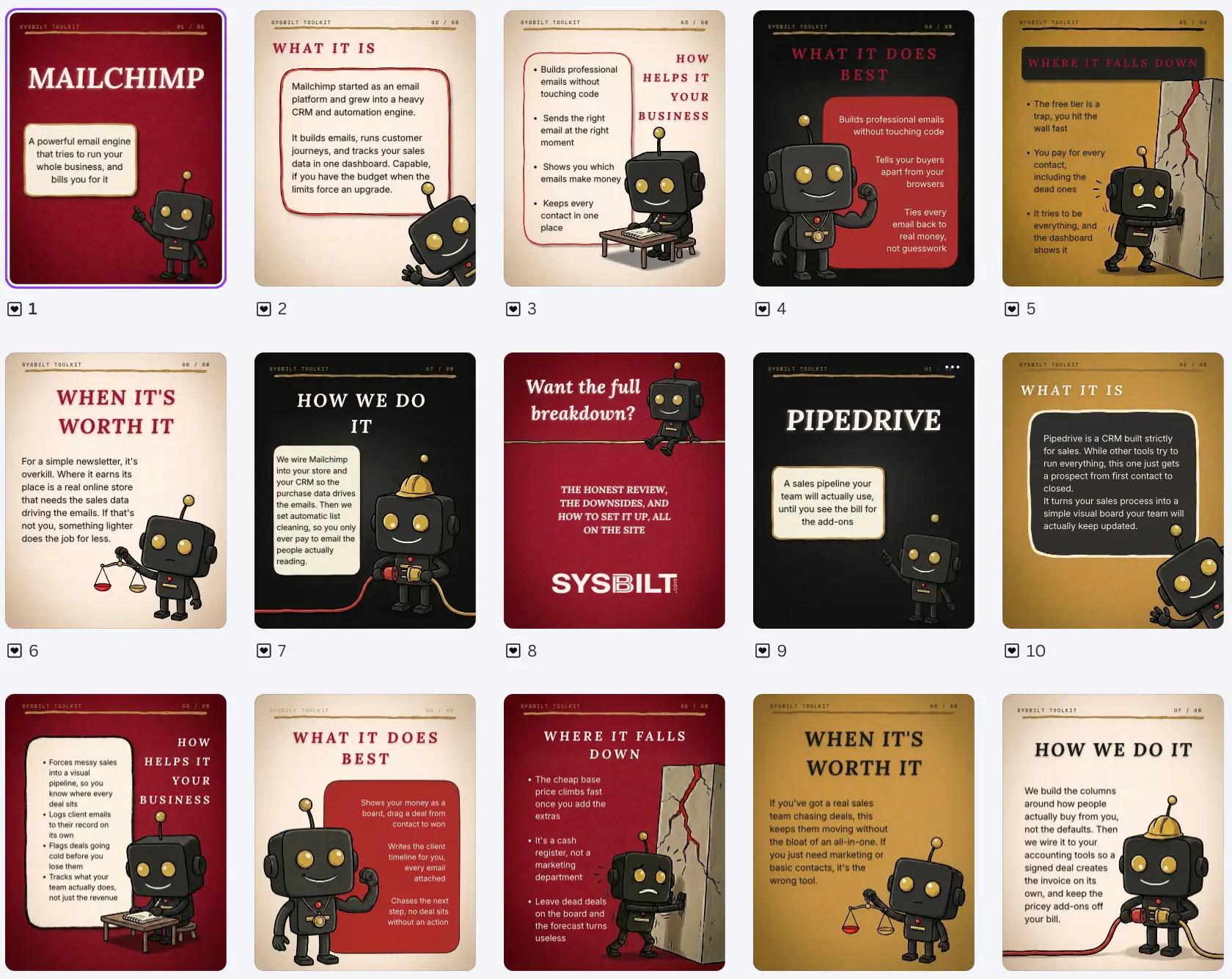
The three layers of every slide
Once you see what each slide is made of, you stop fighting the wrong tool for the job.
Every slide is three layers stacked on top of each other. When you know which layer you're working on, you know which tool to reach for, and the whole thing stops being confusing.
The background, the texture, and your character. This is the warm, hand-drawn part that makes the post feel like a real thing and not a template. It's generated, not assembled.
The header, the page number, the line across the top, any boxes. These stay in the same place on every slide, which is what makes a set feel like a set. They're assembled, not drawn.
Your actual words, sitting on top. Always added last, in a layout tool, because words have to stay sharp and easy to swap for the next post.
Everything in one tool
You try to generate the whole slide, words and all, in an image tool. The text comes out blurry and wrong, and no two slides match.
The right layer in the right tool
Art is generated, structure and text are assembled on top. Sharp words, consistent set, editable forever.

Give it a character
A consistent character is the cheapest recognition you'll ever buy. People know your post in half a second.
The strongest accounts in this space don't rely on a logo to get recognised, they rely on a character. A little mascot that shows up in every post, doing something different each time, becomes the thing people remember. It carries your brand without you saying a word.
The trick is that the character has to stay the same across every image while the pose changes. Same body, same colours, same face, different action. You get there by drawing it once, then using that first drawing as the reference for everything after it.
Use an AI image tool to create your mascot in the style you want. Don't settle until the look is right, the texture, the linework, the feel. This first image becomes the master that everything else copies, so it's worth the time.
Prompt to draw the character: A friendly hand-drawn cartoon mascot, [describe your character: shape, colours, key features], drawn with a bold slightly wobbly hand-inked black outline and soft cel shading, warm and characterful, not flat vector. Centre the features, plain warm-cream background, character centred with space around it, no scene.
Attach your master and ask for the same character in several poses at once, on a plain background. Now you have a reusable cast you can pull from, instead of redrawing the character every time and hoping it matches.
Prompt for the pose sheet: Using the attached image as the character reference, draw the same character in six different poses in a clean grid on a plain white background. Keep the character identical in every pose, change only the action. The poses: [list six, for example waving, pointing at a sign, thinking with a hand on chin, running, holding something, giving a thumbs up]. Same scale, same style, evenly spaced, no text.
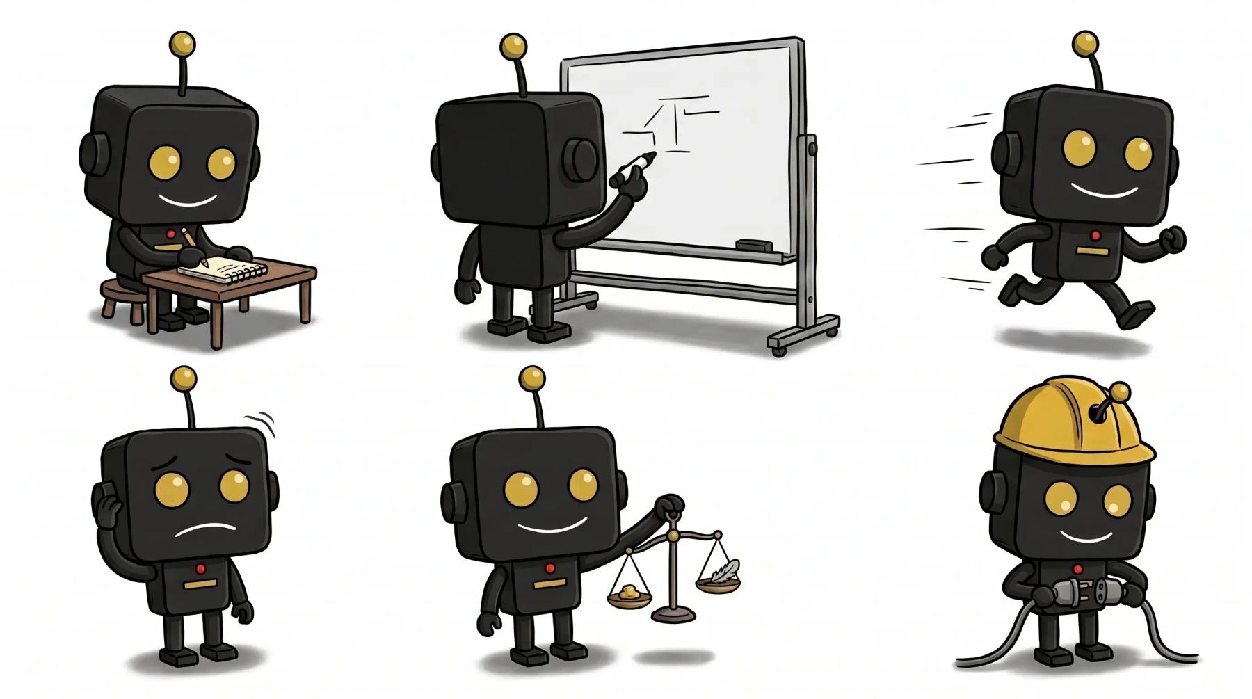
One character, many poses, drawn in a single consistent style. This is the cast you pull from for every post.
How we do it
When we build a character system for a client, we lock the master drawing and the colour values first, then generate a pose sheet they own outright. After that, a new post never starts from scratch, it pulls a pose that already matches. The character becomes an asset the business keeps, not a one-off image.
Lock one structure
The character moves freely, but the frame stays still. That tension is what makes it feel designed.
People confuse consistency with sameness. They're not the same thing. The structure is what repeats, the order of the slides, the position of the header, the line across the top. Inside that fixed frame, the character and the scene change on every slide. Steady frame, moving story.
For a tool or a topic you review often, a fixed running order does the heavy lifting. Pick a sequence and use it every time. Your audience learns the rhythm, and you never have to design the flow again.
- A cover that names the subject
- What it is, in plain language
- How it helps
- What it does best
- Where it falls down, the honest part
- When it's worth it
- How you'd actually set it up
- A close that points somewhere useful
That running order isn't sacred, it's just one that works. The point is to have one and keep it. The slides stay in the same order, the header sits in the same spot, and the page number ticks up. Everything else, the colour, the box, the pose, is free to move.
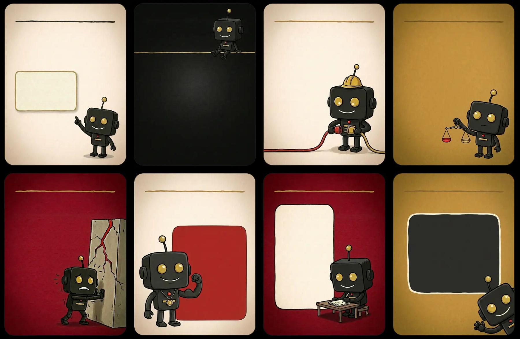
The build, step by step
Generate the art, assemble the structure, drop in the words. Same three moves every time.
In your image tool, generate each slide's background with the character already in it, doing something that fits that slide. Name the exact background colour, describe the pose, and leave any boxes empty so words can go in later. Attach your character reference so the mascot stays itself.
Prompt for a slide scene: Vertical 4:5 poster on a [colour name and hex] background with subtle paper grain and a thin gold hand-drawn line across the top. Place the attached character [where, and doing what that fits the slide]. Leave [this area] empty for a heading, and draw one empty rounded-rectangle box with a [colour] outline where the text will go. Keep the character identical to the reference, hand-drawn and warm. No text, boxes left blank.
Bring the image into a simple layout tool, add the header, the page number, and your text on top. Set your fonts once. This is where the words live because they have to stay crisp and easy to change.
Prompt to turn long content into slide text: Here is a section of writing: [paste your paragraph]. Rewrite it as short slide copy for one carousel slide, in plain language, no more than [two or three] short lines or bullets. Keep it punchy and easy to read on a phone, match this voice: direct, warm, no hype, no exclamation marks.
Export each slide as an image and post the set. For the next subject, you duplicate the layout, swap the words and the page number, and you're done in minutes.
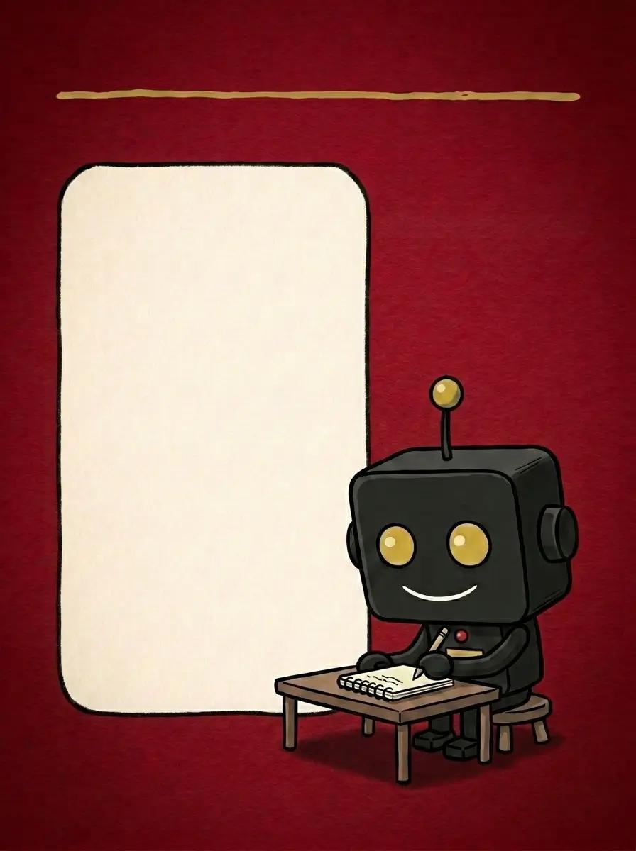
The character generated into a finished scene, with space left for the words to be added on top.
Why not do all of it in one AI tool
Because not everything needs the same tool. Image tools are brilliant at warmth and texture, and poor at clean, swappable text. Layout tools are the reverse. Forcing one tool to do both is where people lose hours and end up with a result that looks slightly off. Use each one for the part it's good at, and the whole thing gets faster and looks better.
One deck, four looks
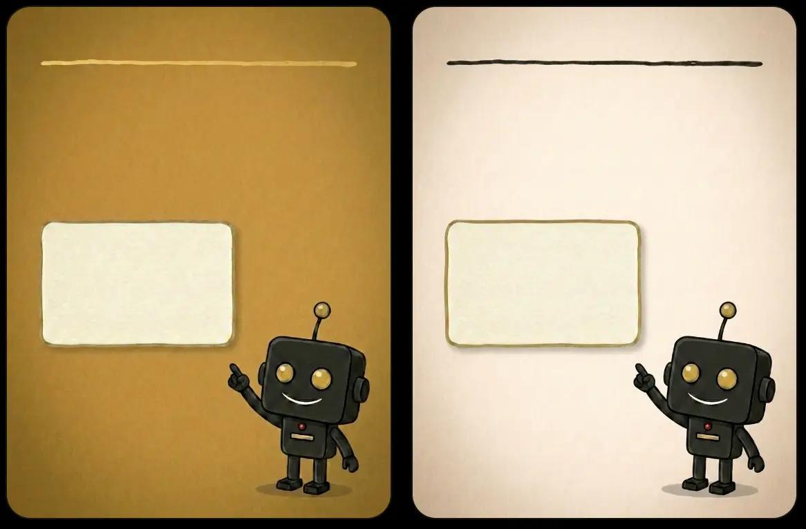
Build it once, then recolour it. You get a family of posts that look related but never identical.
Pick a small set of brand colours and treat them as a palette you can rotate. Hold one colour as your anchor, on the cover and the close, so the brand stays steady. Let the slides in between move through the other colours, as long as the anchor shows up somewhere on each one, in a box, a heading, or something the character is holding.
Once the deck works in one combination, you can recolour the same scenes into the others. That's how you get several posts that clearly belong together without designing each one from scratch. Same family, different outfit.
How we do it
We set a client's palette as a fixed set of values and build one master deck. From there we produce the colour variations as a batch, so a month of posts comes out of a single afternoon's work. The look stays disciplined because the colours are decided once, not improvised post by post.
Where this can run itself
Once the system is set, parts of it can be automated so the content keeps coming with less hands-on work.
The real saving comes from reuse. The words for each post don't have to be written fresh, they can be sliced from longer content you already have, a tool review, a blog post, a page on your site. One piece of writing becomes a carousel, a set of captions, and an email, instead of three separate jobs.
From there, the publishing can be connected. Where your content already lives, it can flow into a scheduling tool that formats and posts it across your channels on a calendar, so a finished deck doesn't sit waiting for someone to upload it five different ways.
- Pull the words for each slide from content you've already written
- Keep the master deck and its colour variations in one place you reuse
- Connect that source to a scheduler so posting happens on a calendar, not by hand
- Let one piece of writing become a carousel, captions, and an email
How we do it
We connect the pieces so the busywork disappears. The content source feeds a scheduler, the formatting and resizing happen automatically, and posting runs on a calendar across every channel. The owner approves once, and the system handles the rest. That's the point of just enough technology, the work happens without you sitting in the middle of it.
Start with one
You don't need the whole system on day one. You need one character and one finished post.
The mistake is trying to perfect everything before you post anything. Draw your character, build one cover, finish one slide. Once a single post exists, the rest is repetition, and repetition is where this system pays you back. The first one is the hard one, and after that it's mostly swapping words.
Consistency beats polish. A steady, recognisable post every week will do more for you than one perfect post you make and never repeat. Build the system, then let it run.
Want us to build the system for you?
We'll set up the character, the templates, and the workflow so your team produces on-brand content without starting from a blank page. Book a call and we'll walk you through how it applies to your business.
Book a callWe teach you the whole method first. The build is for when you'd rather not do it yourself.