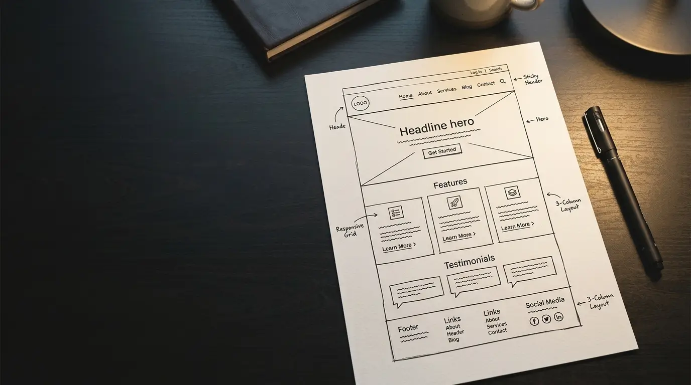
Every page that brings in business shares a structure. Once you can see it, you can look at any page, your own or a competitor's, and tell within moments whether it was built to convert or just to fill space. This chapter gives you that eye.
The shape of a page that converts
A converting page moves a visitor through four steps, in order, without them noticing the steps at all.
First, the hero, the area at the very top, makes one clear promise about what you do and who it is for. Second, proof backs that promise up, evidence that you can deliver. Third, the offer makes the next step worth taking. Fourth, a single clear action tells the visitor exactly what to do, whether that is to call, enquire, or book. That is the spine of almost every effective page. Most pages that fail do so because they skip a step, bury the action, or try to do all four at once and end up doing none of them well.
What persuades, and what captures
It helps to separate two jobs a page is doing at the same time.
One is the message, the words and images that make someone want what you offer. This is persuasion, and it is where your marketing lives. The other is the mechanics, the form, the button, the booking tool that lets them act the moment they are convinced. This is capture. A page needs both, working together. Persuasive copy with no clear way to act wastes the interest it creates. A tidy form on a page that gave nobody a reason to fill it in stays empty. The art is to build desire, then, at the exact moment it peaks, make acting on it effortless.
The words that do the work
People skim. They do not read a web page the way they read a letter, so the few words that carry weight have to be the right ones.
The clearest example is the button. "Submit" tells the visitor nothing and asks for effort. "Book my consultation" tells them exactly what happens next and what they get. The wording on a single button can change how many people press it, and it costs nothing to get right. The same is true of the small instructions all over a page. "Learn more" is vague and weak. "See how it works" tells the visitor exactly where they are about to go. And the same goes for forms. Every extra field you ask for is another small reason to give up, so you ask only for what you need to make the next move, and no more. The shorter and clearer the path, the more people walk it to the end.
Weak
Works
Proof, where it can be seen
Trust is decided early, often in the first screen, before the visitor has scrolled. So the evidence that you are the real thing belongs high on the page, not hidden at the bottom where few people reach.
That means a genuine review or two near the top, real photographs of your work or your people rather than stock imagery a visitor has seen a hundred times, and clear, easy contact details that signal there are real people behind the business. These signals do quiet, constant work. They answer the question every visitor is silently asking, can I trust this business with mine, and they answer it before doubt has a chance to set in.
Motion, used with restraint
Movement on a page, done well, makes a site feel alive and considered. Done badly, it irritates and distracts.
The difference is restraint and purpose. A subtle reveal as a section comes into view, a gentle response when something is selected, these guide the eye and make the experience feel crafted. Motion for its own sake, things spinning and sliding for no reason, does the opposite, getting between the visitor and what they came for. The aim is never to show off what is technically possible. It is to make the page feel effortless to move through, with every piece of motion earning its place by helping rather than performing.
Built for the phone first
Most people will see your website on a phone. Not a desktop, not a tablet, a phone, often while doing something else. So the phone is not an afterthought to check at the end. It is where the page has to work first.
A page built for the phone is easy to read without pinching and zooming, easy to tap without hitting the wrong thing, and quick to load on a normal connection rather than office wifi. When a page is designed for the phone first and then expanded to larger screens, it works everywhere. When it is built for a big screen and squeezed down afterwards, it shows, and it shows to the majority of your visitors.
What good design buys you
Pull these pieces together and you can see what design is actually for. It is not taste for its own sake. A well-built page earns trust in the first seconds, holds attention long enough to make its case, and makes acting on that case the easy and obvious thing to do. It carries the sense that this is a business worth dealing with. That is the return on good design. Not applause, but a steady stream of people who arrive, believe you, and reach out, because everything about the page told them they were in the right place.